But Hey, It Looks Good!
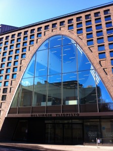
 This fall has brought a big change to the university campus in the center. Namely, the opening of the much-hyped, eagerly anticipated Kaisa-talo, the modern main library of the university. I walked in through the revolving door on the opening day and looked up. At first glance, I was blown away by its beauty, its swooping, smooth and simple design, its wide open spaces and its sheer light. I could hardly wait to acquire one of the recliners by the big window facing Kaisaniemenkatu for a study session. It wasn’t long before I met the reality of Kaisa-talo. It was when I’d spent a good 30 minutes searching for a place to sit and read, then sat down on the stairs out of annoyance and thought to myself what good is a library where there is no space, where it’s loud and where there are no computers. (Later in the fall, I found the few computer rooms.)
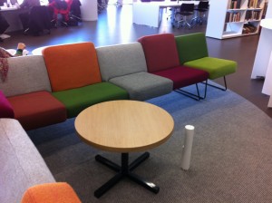
I have quite a few specific problems with Kaisa-talo (like the talking elevator that actually seems to confuse people more than anything), but the biggest issue is the use of space. I know what the aim was with leaving enough room between the bookshelves for me to lead my 700-kilo horse between them. It was to emphasize the spaciousness of the library. To me it says: “Look how much space we can afford to waste!” Well, the students wandering up and down the stairs, searching for a seat feel differently. Here’s a radical idea: push them closer to each other so there’s more room for chairs and tables. And get rid of the colored chairs that have no tables and face the windows in neat rows. They are silly. I can guess what the people responsible for laying out the décor of the library were thinking when they set up the sofa-type seats that only have one or two small round tables to go around. Style. It looks good. But it’s awkward as hell to try to share a tiny table with three strangers.
 One day, perched on a chair, as I watched a group of tourists walking around the library, taking pictures and talking rather loudly, I wondered who the library was built for. It doesn’t seem it was made with students’ needs in mind. The library looks painfully like a form over function issue. I wondered about the lack of computers throughout the library and I finally figured it out: empty white surfaces look nicer than rows of computers. Everywhere you look, there are sockets for laptops. For people who have laptops or iPads. Not everyone does.
The opening of Kaisa-talo meant the end of the Metsätalo library, my chosen place to study for the last three years. The space where there used to be computers and places to sit and study is gone. Aleksandria is at full capacity almost every day from morning till evening and I’ve given up on using my print quota. I wanted to like Kaisa-talo. If not for anything else, then for its beauty, but I rarely go there anymore. If I do, it’s just to get a book or to return one and I’m back out the revolving door with the World Design Capital 2012 mark on it.
