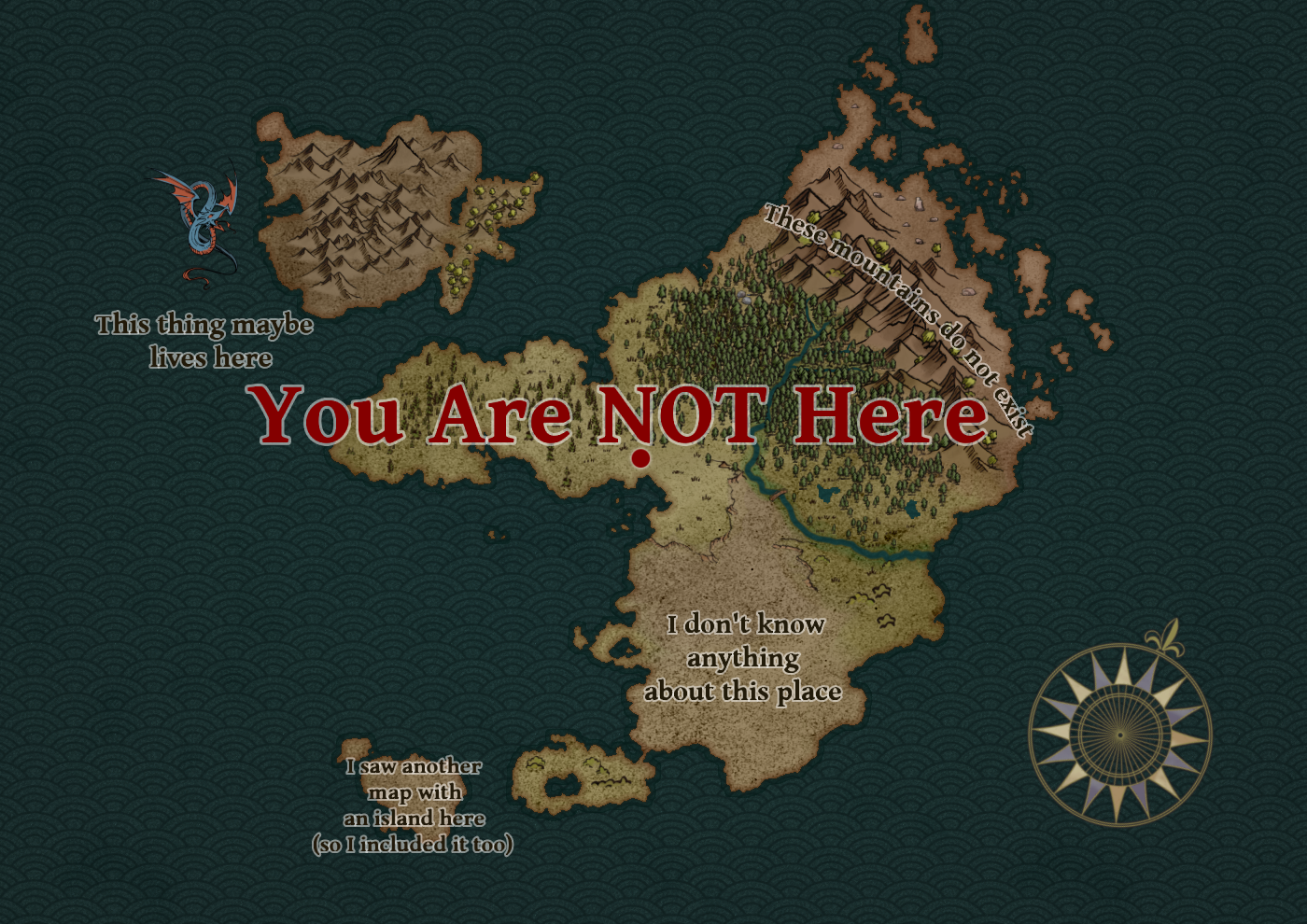
You Are NOT Here — How to understand maps
What’s on a map?
That sounds like a dumb question, but it vastly depends on what the mapmaker wants there to be. Or what they want to leave out. We all understand, at least in principle, what a map is. They show us cities and mountains which are easy to verify with satellites or our own eyes. We also visualize data with maps: Stats and graphs like the number of tigers in Bangladesh. Having a map clearly display that information is admittedly easier than picking up a satellite photo and manually counting all the big cats. I’d probably miss a few.
Data might be as simple as drawing national borders and colouring different nations. Yet they can be disputed. Some claim one map is accurate, others say those borders aren’t real. Some maps aren’t even meant to be real, but more on that later.

(Hereford Mappa Mundi, c. 1300, see here for more details of the locations)
You can learn from maps if you look closely. A child might see the continents for the first time and realize, "Africa and South America fit together like a puzzle piece!" and now they're closer to understanding plate tectonics.
Perhaps you already knew about that, so I have to try harder to impress you, dear reader. Have you ever looked at the borders of the largest empires and realized: They are more wide than tall? Maybe you haven't, but there's a reason why nations conquer more east and west rather than north or south. The maps are there to reveal that pattern.
The Mongol, the Russian, the Umayyad, and the Roman Empires… All wide. That’s because the further you go north or south, the more the climate will change from what the warlords and their soldiers are used to. It’s as simple as that. There are, of course, details and exceptions (such as Egypt following the Nile, or the Incas following the Andes), which this isn’t the place for. We have other questions to consider.
What’s so special about maps? What’s there to understand about the information on them?
You can have maps that tell a story through that information.
You can have maps that lie.
At worst, this can create false narratives, intentional or otherwise.

Here's a part of a map from the Catalan Atlas (1375), featuring Mali (another empire) and one of the richest men in history, Mansa Musa. There are many maps that show the same parts of the world, but they don't all contain the same information. Other historical maps show Mali as empty, with no ruler, no cities, no labels. Are there even people there? The map can’t tell. There’s also the risk of including more than there actually is. Some maps featured a fictional mountain range starting near Mali for almost a hundred years, known as the Mountains of Kong. The mapmakers didn’t know the regions it went through, so they just kept including it until it was widely established to not exist by 1889.
This isn't restricted to just historical maps of Africa. Modern Wales sometimes gets absorbed into England while Scotland and the two Irelands are kept distinct. The nightmare would be if the entirety of the British Isles gets covered by a big label of "ENGLAND". Wales, Scotland and Ireland are always under the mapmaker’s whim. How will they be represented next time? What if Cornwall wants to be separately mentioned? And have you ever noticed how often Åland just disappears? Same goes for many islands, even poor New Zealand.
Granted, sometimes details must be discarded. Small Åland is just difficult to draw in broad strokes, and New Zealand might get cropped out, possibly by accident. Or maybe the map isn't about cities or national borders, so you leave all those problems behind. You wouldn't expect to find your favourite pizza restaurant on a map that showcases the spread of vaccinations.
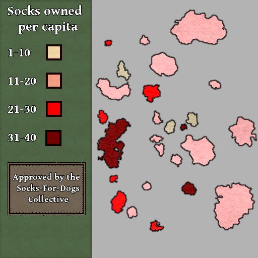
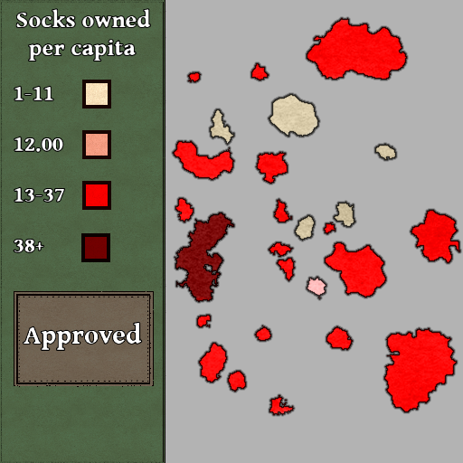
Numbers are deceptively easy details to alter. We enjoy numbers and treat them as cold, hard facts, but what also matters is how they are presented. Compare these two maps on the distribution of socks for this (fictional) archipelago. They use the exact same information to paint a different picture. I’ll leave you to decide how sock stats should be displayed. There isn’t a universal standard for that.
Speaking of lies and manipulation… We have fiction.
I'm not an expert navigator. At least I trust myself to find my way home from the wilds if the forest I'm in is close enough to a subway station. But on the other hand, I know some fictional maps better than real ones.
When making a map out of nothing, you are often subconsciously constrained by the limits of what's in front of you. That is the paper. You don't want any empty space on that paper, so you keep adding rivers, towns, and scary volcanoes until there are no blank spots to taunt you. After all, who would pay for empty space on a map?
Once you realize artists really just want to fill an A4 or some canvas of pixels, you start seeing that shape everywhere. Looking at you, A Song of Ice and Fire. Just google the map of Westeros, you'll see A4:s stacked together, I promise. Long coastlines that run directly east to west or north to south are a giveaway of filling an A4. Everything important can then be shown as A4-sized bricks.
Yet maps don't always have to be geographically accurate. Even some real ones. You can have maps that take you to an adventure. They might show the way to a treasure, but you must follow the exact instructions to reach it rather than measuring your way there directly. That's right. Maps don't even need an accurate scale.
“Ah”, you say, “But that’s just medieval times. These days we can accurately measure distance.”

Well, this is a subway map. And it most certainly does not reflect the real shape or proportions of the Helsinki subway. The path is artificially straight. A lot of details are missing. We can’t even see when the train is underground or above. Yet we find it more useful like this. It points us to where the train is going and therefore must be viewed at the correct location. Practical, but not a “real” reflection of the world.
None of the maps in this article are fully accurate in terms of scale, but there was still a reason to everything the mapmaker chose to include or exclude. Maps tell about the people who made them. They can capture the soul of the world, at least according to how it is seen by us humans. With a blank canvas (or a screen) in front of us, we can make that world look like anything our minds come up with.

The Bünting Clover Leaf Map (1581) has the Afro-Eurasian continents as leaves. The three parts of the old world, with Jerusalem connecting them through trade, religion and conflict. Contrast the relatively sparse details on this map with Hereford Mappa Mundi at the beginning of this article. Both chose to place Jerusalem at the centre of it all.
And if a traveller wanted to go from Jerusalem to somewhere in India, they’d have a handy line of locations to go through one at a time, just like traveling with a subway. Ask for directions to the closest city towards India and then start walking there. At the new city, ask for directions again. Repeat the process until you’re in India. Who needs satellites?
But what about when you don’t have a map? Or maybe you do have one, but you don’t trust it for accurate navigation because it appears to be three leaves.
A lack of maps can damage our understanding. Medieval Europeans were engrossed by the idea of Prester John, a mythic Christian king, descended from the biblical Wise Men, supposedly ruling somewhere out there. A firm speculation placed him in India, but what if he is in Aksum (known today as Ethiopia)? Aksum is next to India, right? …Right? It seemed like it to any sane European, as long as they had no map that included the vast Indian Ocean separating the two.
More famously we have an Italian man who set sail to India, not knowing there was another continent that got in his way. How rude. At least we got more maps out of that accident.
This man, Columbus, would have been used to maps that placed Europe at the centre, but there is no scientific reason to arrange the world like so. The edges of maps aren’t (usually) waterfalls, after all. Maps can even be turned upside down and it’s theoretically still the same map. If you were having trouble reading Hereford Mappa Mundi, it may have been thanks to east being located up. And those “wide” empires could just as well have been “tall”.
There’s so much more to talk about, like time zones, the international date line, or the way map projections distort the size of landmasses, but we would be here all day. Or night. I don’t know when and where you’re reading this.
We need maps to understand the world. And unlike books, many of us were never taught to read a map. You've already taken your first step. Perhaps even the third. You can look at maps with fresh eyes. Ask yourself the important questions about them: What was this map drawn for? Who drew it, and when? Where's the closest pizza place, and if it isn’t there, why was it left out?